THE CHALLENGE:
As the first design hire on the marketing team of a digital advertising agency, I found that there was a need for internal and external messaging to be unified. As with many growing businesses, there was a free-for-all of templates and content being used. So, even though the employees were incredibly talented experts in their field, the company's public presence lacked the professionalism that would attract new business from big brands.
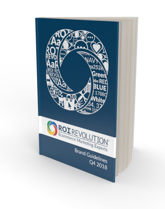
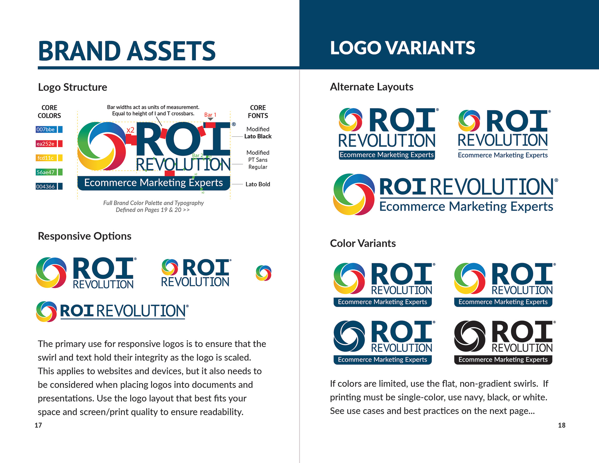
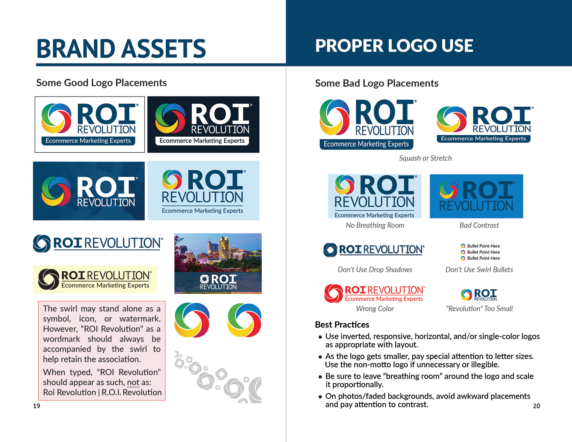
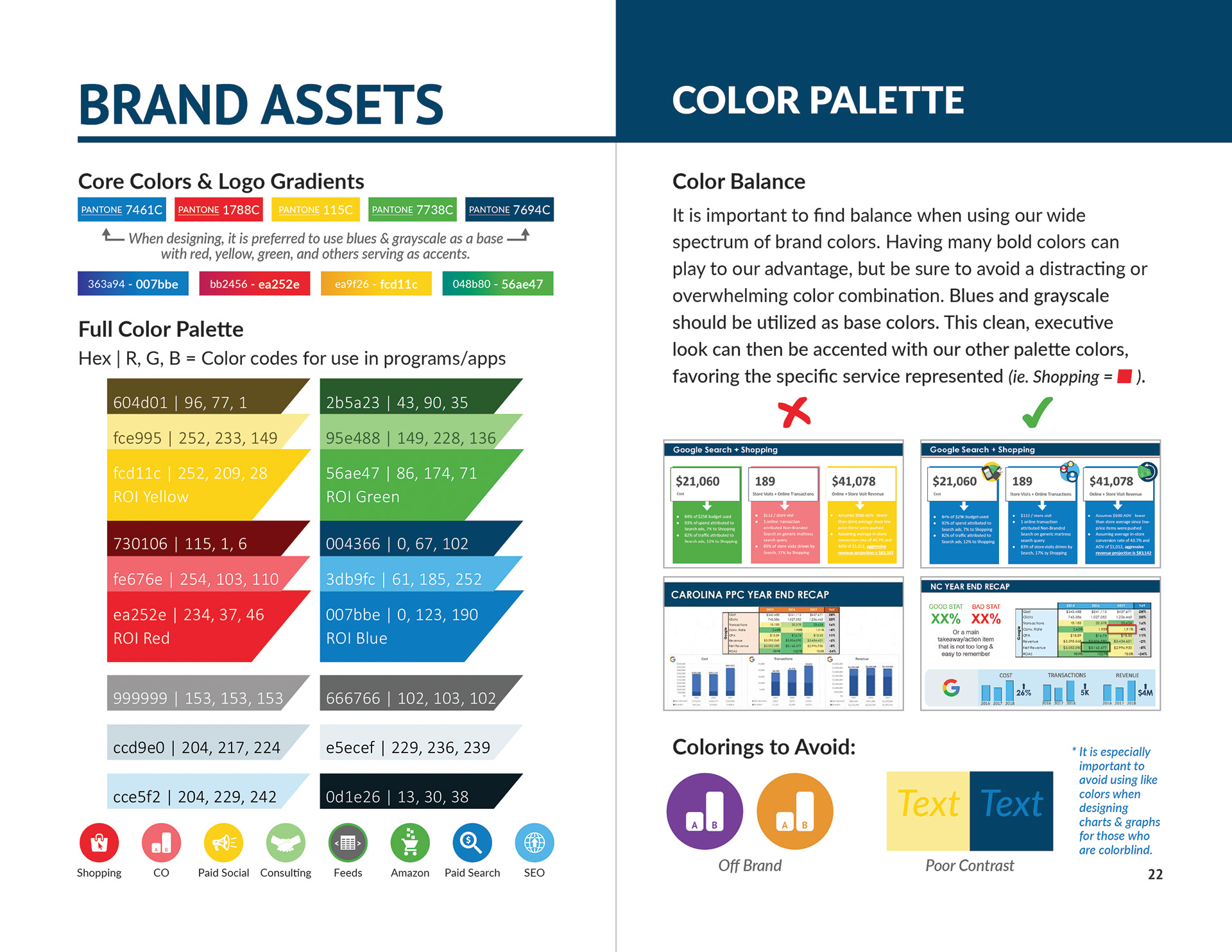
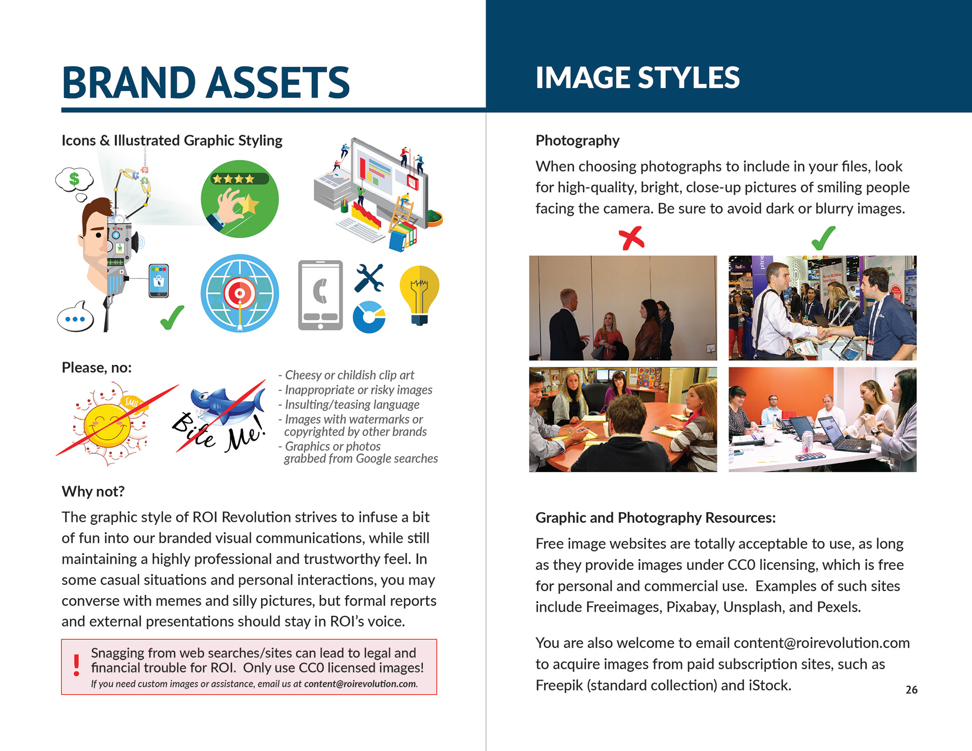
In the role of Art Manager, I collaborated with our COO, team directors, and HR to develop the company's first brand guidebook and presentation resource library. Beyond logos, fonts, and colors, our employees were provided with history, mission/vision statements, and sales value propositions. Getting everyone to buy into the system on a personal level boosted efficiency and effectiveness.
Adobe InDesign, Illustrator, and Photoshop were used to create the 32-page booklet which was printed for each employee and hosted on our internal file-share with links to resource libraries.
(Confidential pages omitted, design pages featured below.)


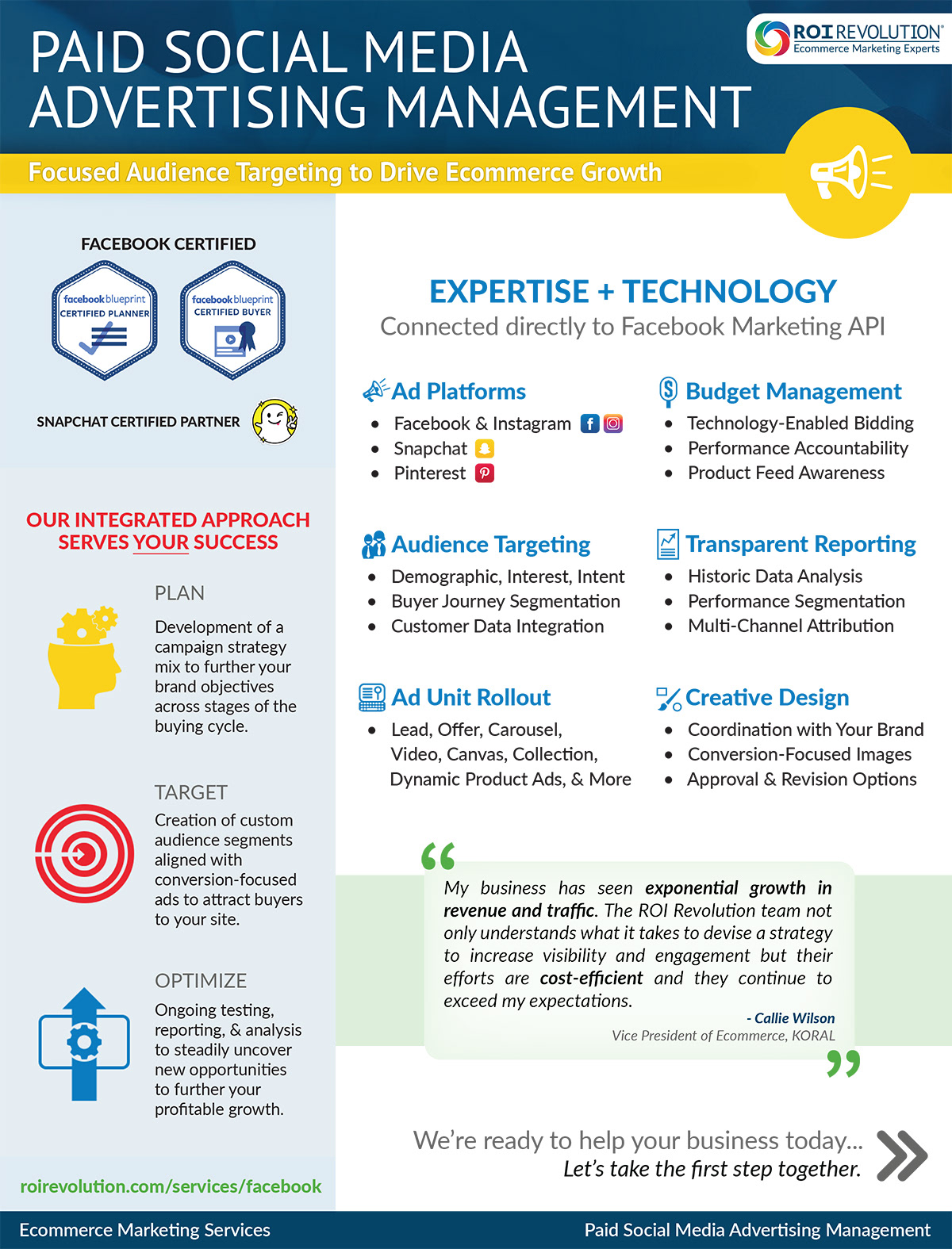
IN ACTION
While use-cases varied and individual styles were designed to give certain campaigns a unique feel, the overall recognition of identity and professionalism permeated designs going forward...


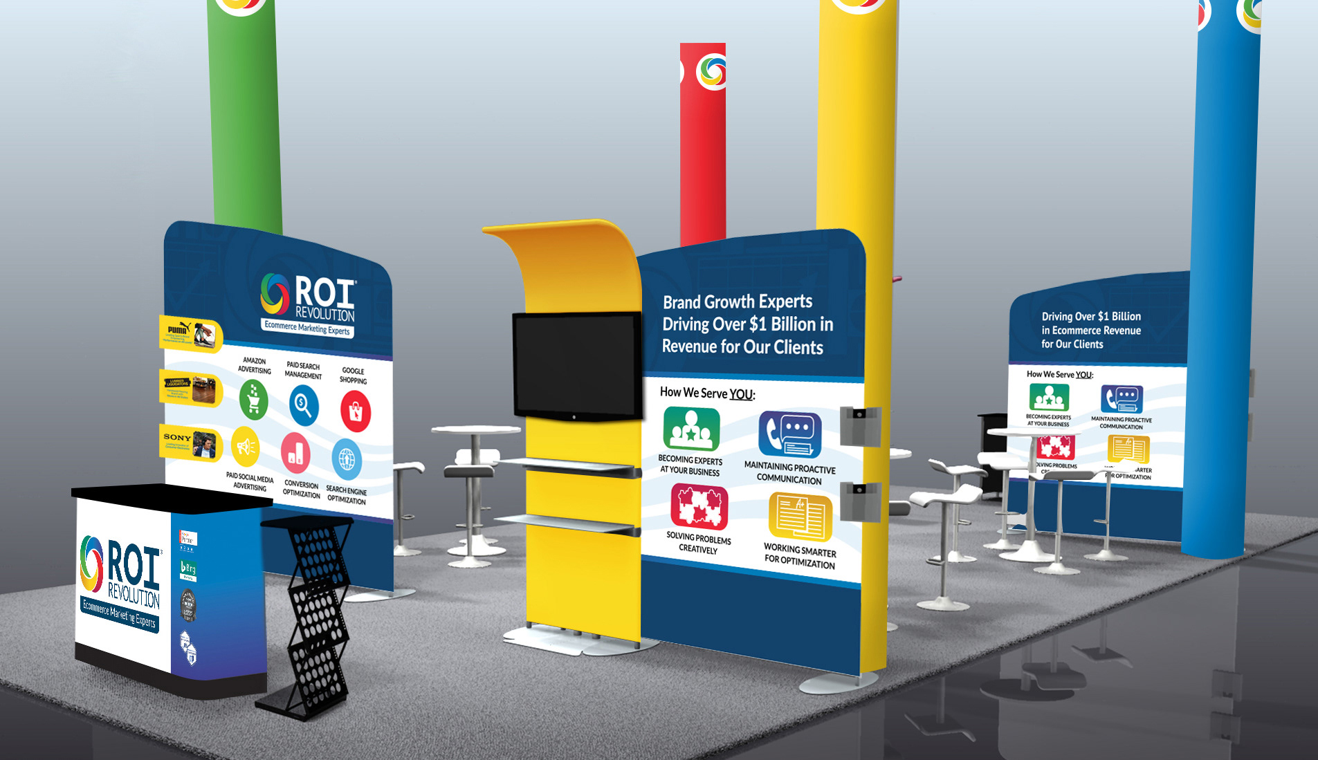

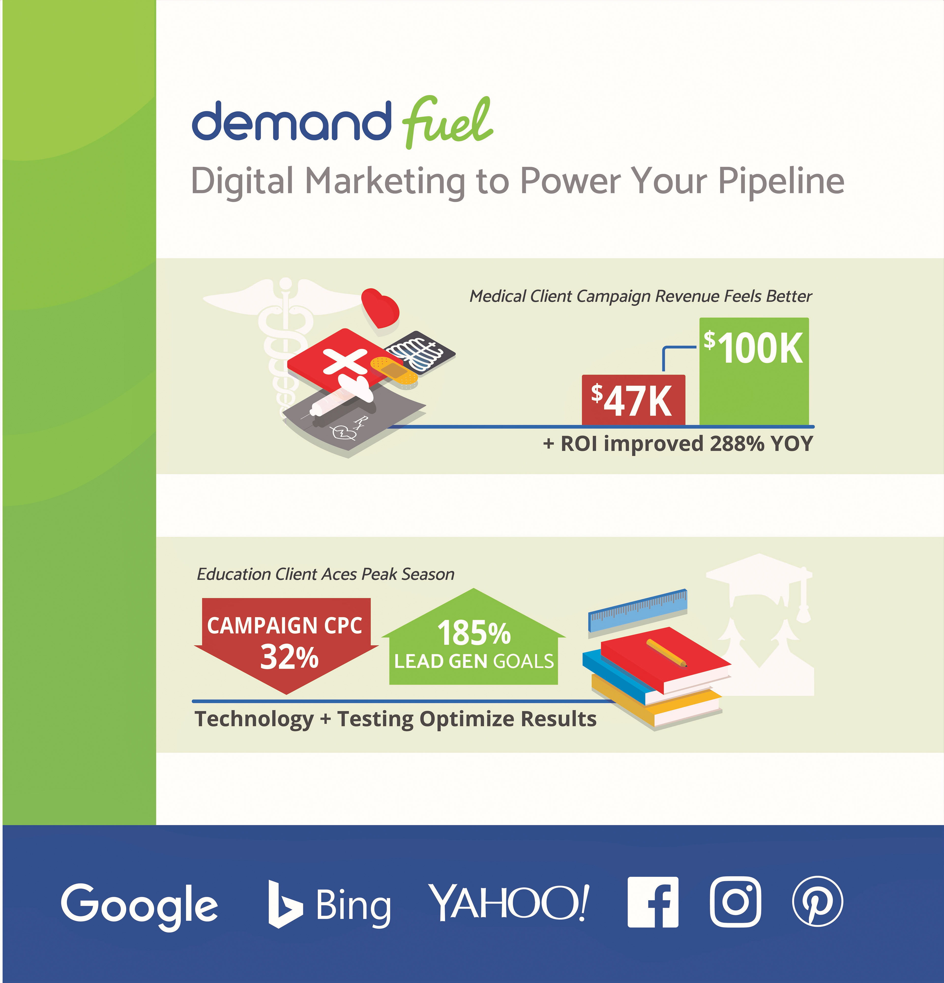
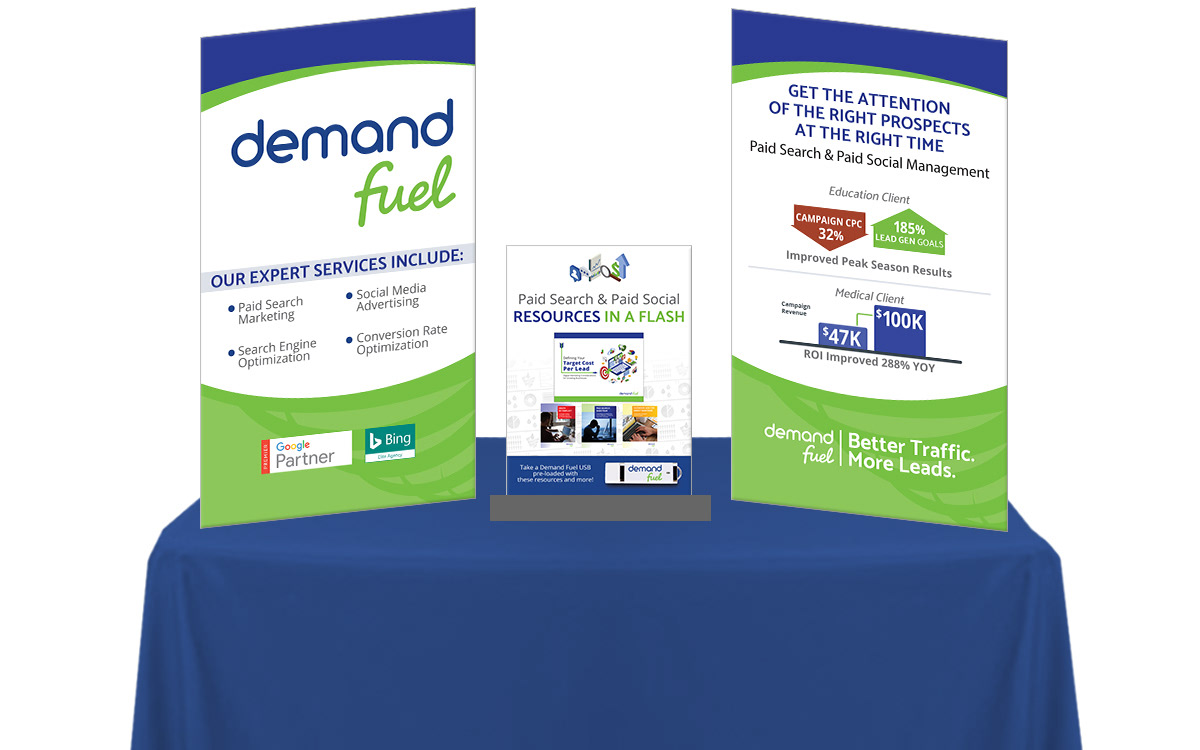
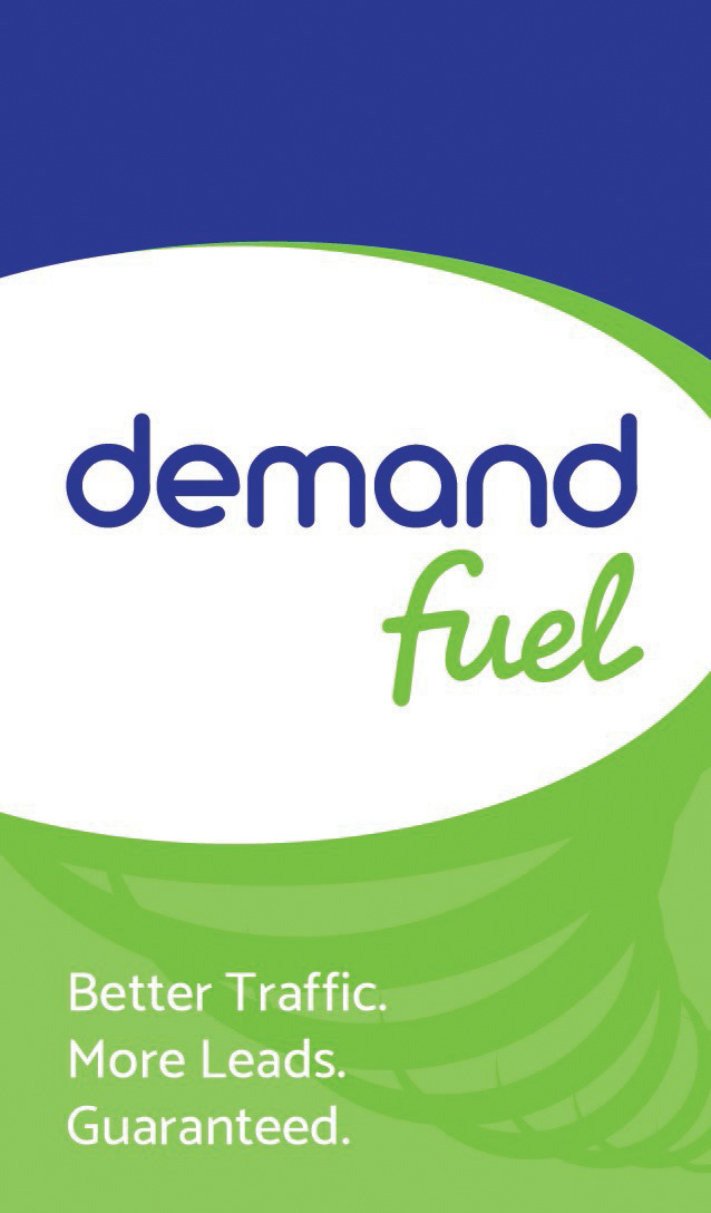
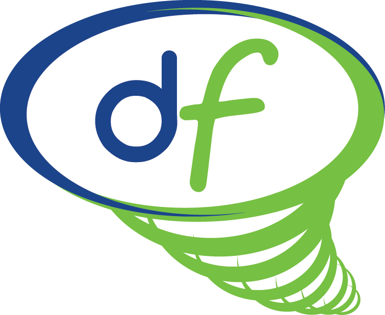
THE NEW KID:
In an attempt to specialize for lead-gen clients who were more focused on selling services than consumer goods, the sub-brand "Demand Fuel" was tested. The following are some creative components of that brand identity, used online and at industry tradeshows.